Network Maps
Three views of the Tutor/Mentor conference participation network (1994–2014), generated from the cleaned dataset. Each map renders live from the database. Images may take a few seconds to load.
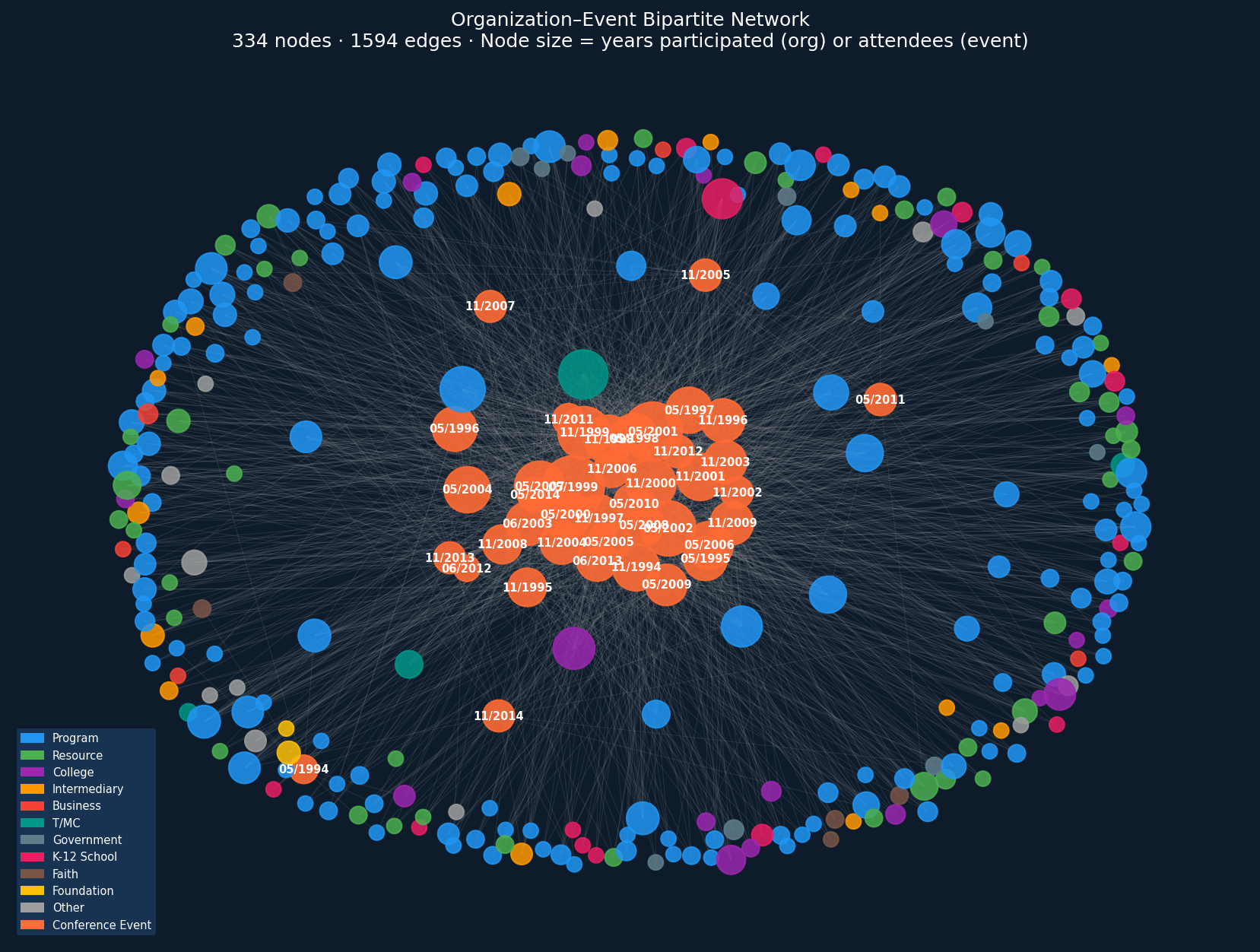
Map 1 — Organization–Event Bipartite Network
Each organization (colored by sector) is connected to every conference event it attended (orange). Node size encodes years of participation (org) or total attendees (event). Only orgs attending ≥3 events and events with ≥10 orgs are shown.
Map 2 — Organization–Organization Co-attendance Network
Organizations connected by shared conference attendance. Edge weight = number of shared conferences (minimum 3 shown). Node size = events attended. Top 20 nodes by degree are labeled — these are the network's most-connected organizations. Color encodes SNA sector.

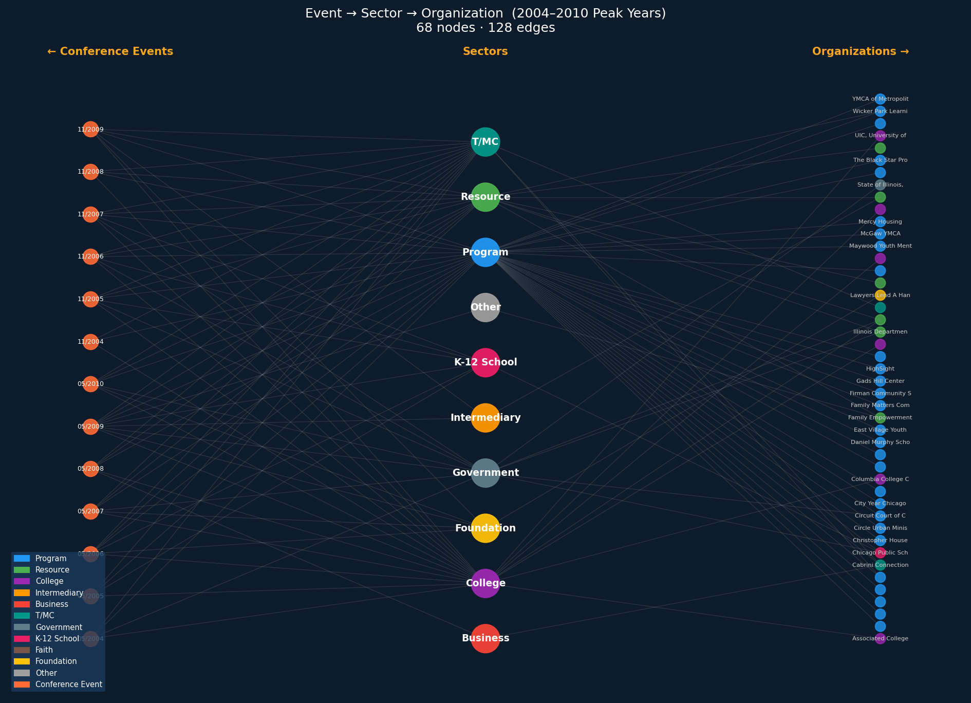
Map 3 — Event → Sector → Organization (Three-Layer, 2004–2010)
A three-layer structural view focused on the peak attendance years (2004–2010). Left layer: conference events. Center: SNA sectors. Right: organizations attending ≥4 events in the window. Shows how sectors bridge events and organizations, and which orgs anchor each sector.
Export for Kumu.io / Gephi
Download the underlying data as CSVs to build interactive versions of these maps in Kumu.io or Gephi.